


In digital systems and logic design, understanding how a system changes behavior over time is crucial. This is where timing diagrams become essential. They provide a visual representation of signals and their state transitions. For beginners, learning to read and create these diagrams is a foundational skill. This guide will walk you through the process of visualizing state transitions without relying on specific tools, focusing on the core concepts that apply to any digital environment. 🎓
Whether you are working with hardware logic, software state machines, or communication protocols, timing diagrams clarify the relationship between events. They answer questions like: When does a signal change? How long does it stay in a specific state? What happens if a clock edge occurs too early? By mastering the visual language of timing, you gain the ability to debug complex systems and design robust architectures. Let us dive into the details. 🚀
What is a Timing Diagram? 🤔
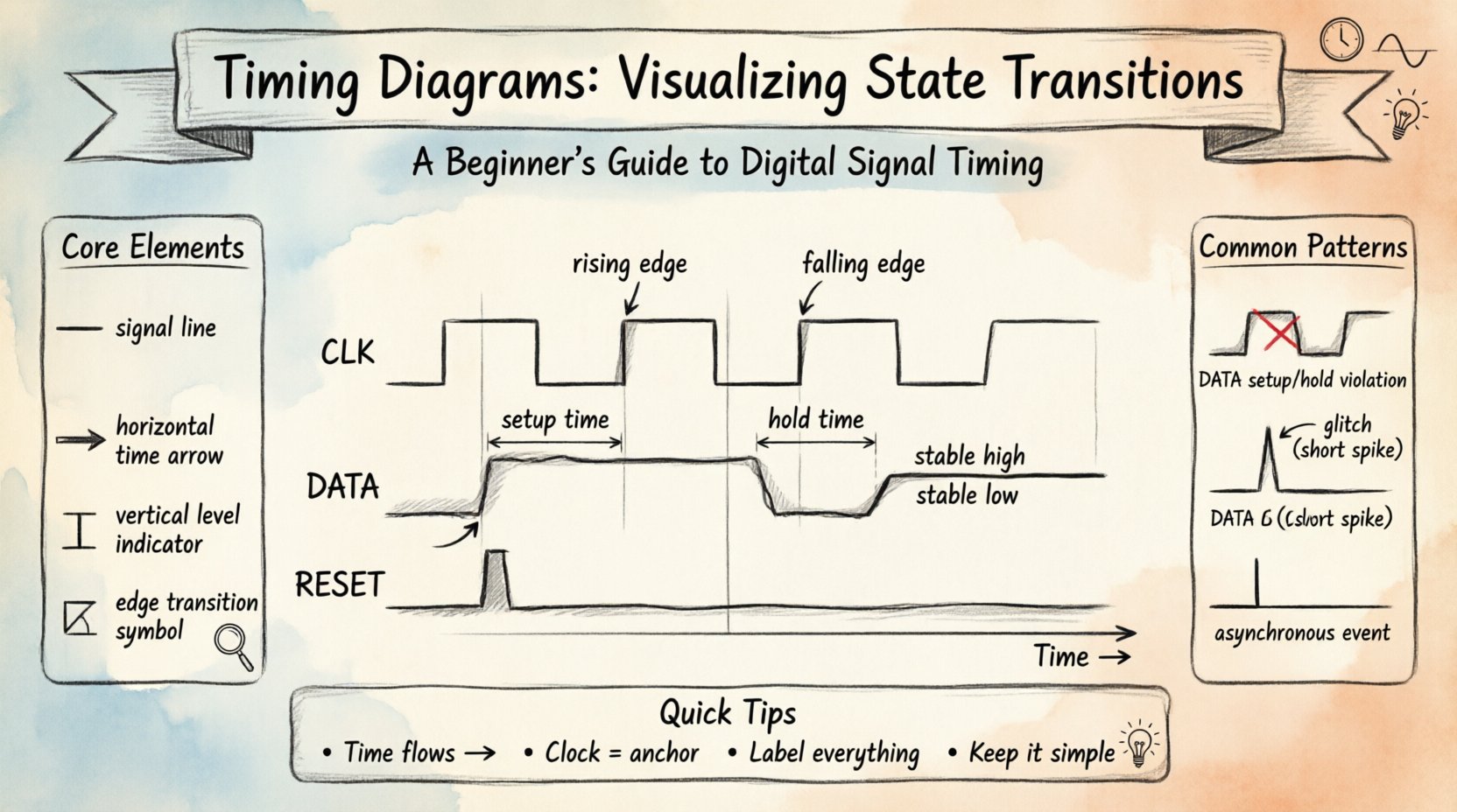
A timing diagram is a graphical representation of how signals change over time. Unlike a circuit schematic that shows connections, a timing diagram shows behavior. It maps the logical level (High or Low) of one or more signals against a time axis. This visualization helps engineers and developers verify that different parts of a system operate in sync.
Here are the core elements you will encounter:
- Signals: These are the lines representing voltage levels, data bits, or control flags. Each signal has a name, such as CLK (Clock) or DATA.
- Time Axis: The horizontal line (X-axis) represents the passage of time. It moves from left to right.
- Signal Levels: The vertical position (Y-axis) indicates the state. Typically, High (1, Vcc) is at the top, and Low (0, Gnd) is at the bottom.
- Edges: Vertical lines connecting High and Low levels indicate transitions. A rising edge goes Low to High. A falling edge goes High to Low.
Visualizing state transitions means focusing on how the signal moves between these levels. For example, a transition from 0 to 1 might trigger a process. The timing diagram shows exactly when this happens relative to other events.
Key Components of State Transition Visualization 🧩
To understand state transitions, you must first understand the components that define the state. In digital logic, a state is usually defined by the values of specific signals at a specific moment. Here is a breakdown of the terminology you need to know.
1. The Clock Signal ⏰
Most digital systems rely on a clock to synchronize operations. The clock is a repeating square wave that dictates when state changes are allowed. In a timing diagram, the clock appears as a regular series of rising and falling edges. State transitions often occur on the rising edge (positive edge-triggered) or the falling edge (negative edge-triggered) of this signal.
2. Data Signals 📡
Data signals carry the actual information. Their state changes based on the logic of the system. Unlike the clock, data signals do not have a fixed rhythm. They change when specific conditions are met. In a state transition diagram, you will see data signals stabilize before and after a clock edge.
3. Control Signals 🛑
Control signals manage the flow of data. Examples include Reset, Enable, or Select lines. These signals dictate whether the system is active or inactive. A Reset signal, for instance, forces the system back to a known initial state. Timing diagrams show exactly when this reset happens relative to the clock.
How to Read a Timing Diagram 📖
Reading a timing diagram requires attention to detail. You must correlate the horizontal time position with the vertical signal levels. Follow this step-by-step approach to interpret any diagram accurately.
- Identify the Time Direction: Always assume time flows from left to right. The left side is the past; the right side is the future.
- Locate the Reference Signal: Find the clock signal. It is usually the most regular signal. Use it as your anchor point for all other changes.
- Trace the Edges: Look for vertical lines. These are the moments of change. Note whether they align with clock edges or occur independently.
- Check for Stability: Between edges, signals should remain flat. If a line is slanted or noisy, it indicates a transition period or a glitch.
- Correlate Multiple Signals: Look at how different signals interact. For example, does the Data signal change immediately after the Clock edge, or does it wait?
Creating a Timing Diagram: A Step-by-Step Guide 🛠️
Creating a timing diagram is a logical process. You start with the requirements of the system and map them out visually. You do not need special software to practice this; pen and paper or a grid layout work perfectly.
Step 1: Define the States 📝
Before drawing, list the states the system must go through. For example, a traffic light system might have states like Red, Green, and Yellow. Write these down clearly. This defines the logical journey of your system.
Step 2: Determine the Trigger ⚡
What causes the change? Is it a timer? A button press? Or the next clock cycle? Mark the trigger point on your timeline. If it is a clock, draw the clock wave first. If it is an external event, mark a vertical line for that event.
Step 3: Map the Transitions 🔄
Draw the lines that represent the signal going from one level to another. Ensure the transition is sharp. In reality, signals take time to switch, but for logic diagrams, we represent this as an instantaneous vertical line. Label the states clearly above or below the signal line.
Step 4: Add Timing Constraints ⏱️
Include setup and hold times. Setup time is the duration before a clock edge that data must be stable. Hold time is the duration after the clock edge that data must remain stable. These are critical for preventing errors. Indicate these intervals with brackets or arrows on the diagram.
Common Signal Patterns and Examples 📈
Certain patterns appear frequently in state transition visualizations. Recognizing these patterns speeds up analysis and debugging. Below are the most common scenarios you will encounter.
1. Setup and Hold Violations ⚠️
These are errors where a signal changes too close to a clock edge. If data changes before the required setup time, the system might read the wrong value. If it changes before the hold time is satisfied, the latch might capture noise. Timing diagrams highlight these violations by showing data lines crossing clock edges within forbidden zones.
2. Glitches and Spikes 🔊
Glitches are brief, unintended pulses. They appear as short vertical spikes that deviate from the expected flat line. They often happen when signals propagate at different speeds through logic gates. On a timing diagram, they look like small teeth on a saw blade. Identifying them is vital for system reliability.
3. Asynchronous Events 🔄
Not all signals are synchronized to the clock. Some events happen at random times, such as a user pressing a button. These are asynchronous. In a timing diagram, they appear as irregular vertical lines that do not align with the clock grid. Handling these requires special logic to synchronize them safely.
Comparing States: A Structured View 📊
Using a table can help you compare different state transitions clearly. This is especially useful when documenting requirements or reviewing designs. The following table outlines common signal behaviors during a state change.
| Signal Type | Typical Behavior | Timing Diagram Feature |
|---|---|---|
| Clock | Continuous square wave | Regular rising and falling edges |
| Data | Changes on clock edge | Vertical transition aligned with clock |
| Reset | Pulsed Low or High | Wide pulse that overrides other signals |
| Enable | Stable High during operation | Flat line that allows data changes |
Troubleshooting State Transitions 🔍
When a system behaves unexpectedly, the timing diagram is your first diagnostic tool. Here are common issues and how to spot them visually.
- Signal Skew: If two signals that should change together arrive at different times, there is skew. Look for horizontal gaps between parallel vertical lines.
- Metastability: This occurs when a signal is caught in an unstable state between 0 and 1. In a diagram, this looks like a signal lingering in the middle of the vertical axis before settling.
- Propagation Delay: This is the time it takes for a signal to travel from one component to another. It appears as a horizontal shift between the input signal and the output signal.
- Race Conditions: This happens when the outcome depends on the order of events. In a diagram, you might see two signals trying to change the same output simultaneously. The diagram will show conflicting transitions.
Best Practices for Clear Documentation 📝
Creating a timing diagram is not just about accuracy; it is about communication. A poorly drawn diagram can lead to misunderstandings. Follow these best practices to ensure your work is clear and professional.
- Use Consistent Scaling: Keep the time intervals uniform. Do not stretch one section and compress another unless you are highlighting a specific detail.
- Label Everything: Every signal line should have a name. Every time interval should have a value if known. Ambiguity is the enemy of clarity.
- Highlight Critical Points: Use bold lines or arrows to point out setup and hold times. Make the most important information stand out.
- Keep it Simple: Do not clutter the diagram with unnecessary details. If a signal is constant, draw a straight line. Only show changes when they matter.
- Align Signals: Ensure related signals are vertically aligned. This makes it easier to see relationships between them.
Understanding Sequential Logic Context 🧠
Timing diagrams are the backbone of sequential logic. Unlike combinational logic, where output depends only on current inputs, sequential logic depends on past history. This history is stored in state elements like flip-flops or latches. The timing diagram shows how this history is updated.
For instance, consider a simple counter. It increments its value on every clock pulse. The timing diagram will show the output bits changing in a binary sequence. By looking at the diagram, you can verify that the counter increments exactly once per clock cycle. If you see multiple changes in one cycle, the design is flawed.
Advanced Considerations for Beginners 🌱
As you become more comfortable with basic diagrams, you can explore more complex scenarios. These concepts build upon the foundation you have learned.
1. Multi-Clock Systems 🕒
Some systems use multiple clocks running at different speeds. Visualizing this requires careful attention to the relationship between the clock frequencies. You must calculate the ratio to ensure signals align correctly. This often involves drawing multiple clock lines at the top of the diagram.
2. Power Management States 🍃
Modern systems save power by entering low-power states. Timing diagrams for power management show signals turning off or going into high-impedance states. You will see lines dropping to a flat state that represents no activity. This is crucial for understanding battery life and thermal performance.
3. Data Bus Width 📏
Buses carry multiple bits at once. A timing diagram for a bus shows a group of parallel lines. All lines should change in sync. If one line changes while the others remain static, the data is corrupted. This is a common source of bugs in communication protocols.
Final Thoughts on Visualization 🧭
Learning to visualize state transitions is a journey of observation and practice. You start by understanding the basic shapes of signals. Then, you learn to interpret the timing between them. Finally, you use this knowledge to design systems that work reliably.
Remember that a timing diagram is a contract between the designer and the hardware. It says, “If I give you this signal at this time, you will give me that result.” When you draw this contract clearly, you reduce the risk of errors. You create a document that anyone on the team can understand.
Keep practicing with different scenarios. Draw diagrams for everyday logic, like a light switch or a door alarm. These simple examples build the muscle memory needed for complex digital systems. With patience and attention to detail, you will find that timing diagrams become an intuitive part of your workflow. They are the map that guides you through the complexity of digital time. 🗺️
By focusing on the core mechanics of signals and time, you build a skill set that is applicable across many fields. Whether in embedded systems, computer architecture, or software engineering, the ability to track state changes over time is invaluable. Start drawing today. Your future self will thank you for the clarity you bring to your designs. 🌟