


In the intricate world of embedded systems engineering, clarity is not merely an aesthetic choice; it is a functional necessity. Timing diagrams serve as the universal language for describing the temporal relationships between signals. Whether you are coordinating a microcontroller with a sensor or defining the handshake protocol for a high-speed interface, the precision of your documentation directly impacts the success of the implementation.
A poorly constructed timing diagram can lead to misinterpretations, costly re-spins, and debugging sessions that consume valuable development cycles. This guide outlines the essential practices for creating timing diagrams that convey complex logic with absolute clarity. We will explore the structural foundations, visual standards, and analytical details required to ensure your diagrams are read correctly the first time.
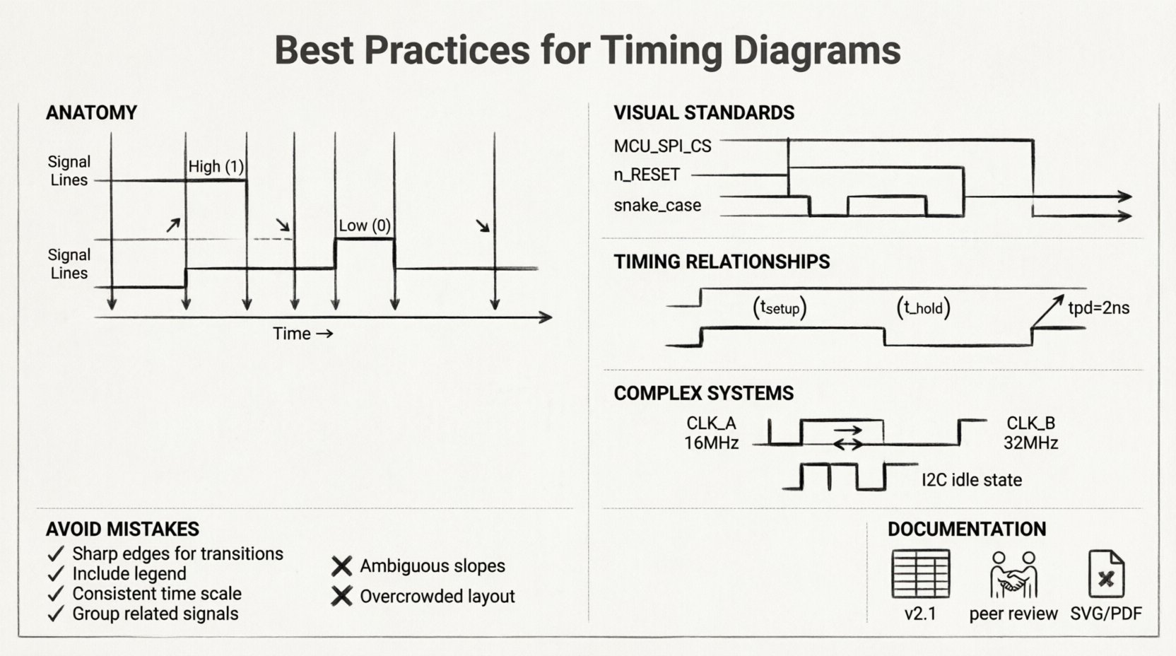
Understanding the Anatomy of a Timing Diagram 📊
Before establishing best practices, it is vital to understand the fundamental components that make up a timing diagram. These visual representations map the state of signals over a specific time axis. Every element on the page must serve a purpose in communicating the system behavior.
- Time Axis: The horizontal axis represents the progression of time. It can be linear, logarithmic, or segmented based on specific events. Consistency in the scaling is paramount to avoid misleading interpretations of delays.
- Signal Lines: The vertical lines represent individual signals or wires. Each line should be labeled clearly to identify its function within the circuit.
- Logic Levels: Signals typically toggle between High (1/Vcc) and Low (0/GND). Clear distinction between these states prevents ambiguity during high-speed transitions.
- Edges: The transitions from Low to High (rising edge) or High to Low (falling edge) are critical moments that often trigger state changes in downstream logic.
When constructing these diagrams, remember that the human eye scans from left to right. The flow of information should follow this natural reading pattern to minimize cognitive load.
Visual Standards for Clarity and Consistency 🛠️
Consistency is the bedrock of technical documentation. When multiple engineers collaborate on a project, or when a design is handed off to a new team, standardized visual cues ensure that the information is transmitted without loss. Deviating from established norms introduces risk.
Signal Naming Conventions
Every signal line must have a unique, descriptive label. Avoid generic names like “Signal_1” or “Wire_A”. Instead, use functional names that indicate the source and destination, such as MCU_SPI_CS or SENSOR_DATA_READY.
- Case Sensitivity: Adopt a consistent case style, such as PascalCase or snake_case, and stick to it throughout the document.
- Active High vs. Active Low: Clearly indicate if a signal is active when high or low. Use overlines (e.g.,
n_RESET) or specific symbols (e.g., bubbles at the pin) to denote active-low logic, but ensure the notation is explained in a legend. - Grouping: Group related signals together. For example, place all address lines adjacent to one another and all data lines together. This visual grouping helps the reader quickly identify bus structures.
Time Scaling and Granularity
The time axis must reflect the actual timing constraints of the system. A diagram that compresses a 1-second handshake into a few pixels is useless for verifying setup and hold times. Conversely, a diagram showing nanosecond-level jitter on a 1-second signal wastes space and obscures the main event.
- Zoom Levels: Use multiple views for complex interactions. A high-level view shows the sequence of events, while a detailed view zooms in on critical transitions.
- Reference Markers: Include markers that indicate specific time intervals (e.g., 10µs, 1ms) to provide context for the duration of states.
- Start and End Points: Clearly define the trigger event that starts the timing sequence. Is it a clock edge? A reset pulse? The start point anchors the entire diagram.
Visualizing Timing Relationships 🧠
The core value of a timing diagram lies in its ability to show relationships between signals. It is not enough to show when a signal changes; you must show how one signal affects another.
Setup and Hold Times
In synchronous logic, data must be stable before and after a clock edge. These constraints are known as setup and hold times. Visualizing these requires specific annotations.
- Setup Time: Indicate the minimum time data must be stable before the active clock edge. Use a dashed line or bracket to highlight this window.
- Hold Time: Indicate the minimum time data must remain stable after the active clock edge. This is often the most critical constraint to verify.
- Violation Indicators: If a diagram illustrates a potential violation, mark it clearly. Do not assume the reader will spot the overlap without guidance.
Propagation Delays
Signals do not change instantaneously. They travel through gates and wires with inherent delays. A timing diagram should account for this latency.
- Dashed Lines: Use dashed lines to indicate theoretical paths or potential delays that are not guaranteed.
- Measured Values: Where possible, annotate the diagram with actual measured delay values (e.g.,
tpd = 2ns). This adds quantitative rigor to the visual representation. - Path Identification: If multiple paths exist (e.g., combinational logic vs. registered logic), distinguish them with different line styles or colors.
Handling Complex Interactions ⚙️
Modern embedded systems are rarely simple. They involve multiple clock domains, asynchronous interfaces, and complex state machines. Handling these complexities in a single diagram is difficult but necessary.
Multi-Clock Domains
When signals operate at different frequencies, the timing diagram becomes a puzzle. Misalignment here is a common source of metastability.
- Common Reference: If possible, use a common time base. If the clocks are asynchronous, acknowledge this explicitly in the header.
- Frequency Labels: Label the frequency of each clock domain clearly. Do not rely on the visual spacing alone to imply frequency ratios.
- Synchronization Points: Highlight where synchronization occurs. Show the handshake signals that bridge the asynchronous gap.
Asynchronous Interfaces
Protocols like I2C, SPI, and UART rely on asynchronous handshaking. The timing diagram must capture the state of the bus when no clock is present.
- Idle States: Clearly define the idle state of the bus (e.g., High for I2C SDA/SCL). Show how long the bus must remain idle before a new transaction starts.
- Timeouts: Include timeout conditions. What happens if the receiver does not acknowledge within a specific window?
- Bit Ordering: Indicate the order of bits (MSB first vs. LSB first). This is often assumed but should never be left to assumption.
Common Mistakes to Avoid 🛑
Even experienced engineers make errors in documentation. Identifying these common pitfalls can save significant time during the review process.
| Mistake | Impact | Correction |
|---|---|---|
| Ambiguous Edges | Readers cannot determine if the transition is fast or slow. | Use sharp lines for ideal edges; slope them for real-world transitions. |
| Missing Context | The diagram shows the “what” but not the “why”. | Add notes explaining the state machine context. |
| Inconsistent Notation | Confusion between active-high and active-low signals. | Create a legend and stick to it strictly. |
| Overcrowding | Too many signals make the diagram unreadable. | Split the diagram into logical sections or sub-diagrams. |
| Incorrect Scaling | Timing relationships appear false. | Use a consistent time scale or clearly mark changes in scale. |
Detailed Breakdown of Specific Errors
One frequent error is the depiction of glitches. In logic synthesis, glitches are inevitable, but in a high-level timing diagram, they can be confusing. Decide whether the diagram represents ideal behavior or physical reality. If showing ideal behavior, omit glitches. If showing physical reality, include them and explain their impact.
Another common issue is the lack of state definition. A signal might be “High,” but is it in a valid state, or is it floating? Use specific notation for high-impedance states (Hi-Z) to avoid confusion with a logical High.
Documentation and Maintenance 📝
A timing diagram is a living document. As the hardware or firmware changes, the diagram must evolve to reflect the new reality. Neglecting maintenance leads to a disconnect between the design and the documentation.
Version Control
Just like source code, timing diagrams require versioning. Every change in the logic, even a minor timing adjustment, should trigger a revision of the diagram.
- Revision History: Include a table at the bottom of the document listing the version, date, author, and a summary of changes.
- Change Tracking: Use color or highlighting to mark changes in the current version compared to the previous one. This helps reviewers spot differences quickly.
Collaboration and Review
Timing diagrams are rarely created in isolation. They are part of a larger specification package. Establish a review process where the diagram is validated by the implementation team.
- Peer Review: Have a colleague who did not write the diagram attempt to implement the logic based solely on the drawing. If they succeed, the diagram is clear.
- Cross-Functional Check: Ensure the diagram aligns with the electrical specifications. A timing diagram that is logically sound but electrically impossible (e.g., violating drive strength limits) is useless.
- Traceability: Link the timing requirements back to the system requirements. This ensures that the diagram supports the broader project goals.
Accessibility and Format Considerations 🌐
Technical documents are often viewed on different devices, from large monitors to mobile phones during field testing. The format of your timing diagram affects its utility.
- Vector Graphics: Use vector formats (SVG, PDF) rather than raster (PNG, JPG). This ensures that lines remain sharp when zoomed in, which is critical for reading small labels and time markers.
- Searchability: If the document is a PDF, ensure that the text is selectable. This allows engineers to search for specific signal names or time values within the document.
- Print Optimization: Ensure the diagram fits on standard page sizes without requiring excessive scrolling. If the diagram is too wide, consider splitting it into logical columns.
Final Thoughts on Precision ⚡
The effort invested in creating a high-quality timing diagram pays dividends in reduced debugging time and higher system reliability. When you prioritize readability, you reduce the cognitive load on everyone who interacts with your design. This includes hardware engineers, firmware developers, and even future maintainers who may not have been part of the original team.
Remember that a timing diagram is a communication tool, not just a record of events. It tells a story about how the system behaves over time. By following these best practices, you ensure that the story is told clearly, accurately, and without ambiguity. The result is a more robust design and a smoother development process.
Focus on the details. Check your labels. Verify your time scales. And always keep the reader in mind. Good documentation is the foundation of good engineering.