Understanding how digital systems function requires more than just knowing what components are connected; you must understand when those components interact. Timing diagrams serve as the visual language for this temporal analysis. They map out the sequence of events, signal changes, and logical states over a specific timeline. Whether you are debugging a communication protocol or designing a new logic circuit, these diagrams provide the necessary clarity to ensure components synchronize correctly.
This guide breaks down the essential elements of timing diagrams, how to interpret them, and why they are critical for reliable system design. We will explore the signals, the axes, and the critical parameters that define successful data transfer. By the end of this text, you will have a solid foundation for reading and creating these visual tools.
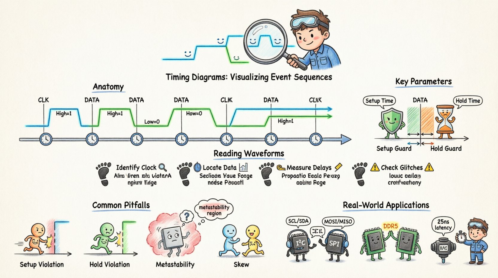
🧩 The Anatomy of a Timing Diagram
A timing diagram is essentially a graph where time flows horizontally, and signal states are plotted vertically. It allows engineers to see the relationship between multiple signals simultaneously. Without this visualization, tracking the interaction between a clock, data lines, and control signals would be nearly impossible.
1. The Time Axis
The horizontal axis represents time. It is crucial to understand that this axis is not always linear in every view, though standard diagrams assume a linear progression. The distance between markers on this axis can represent nanoseconds, microseconds, or clock cycles, depending on the resolution required.
- Scale: Always check the time scale provided. A shift of one unit might mean a significant delay in high-speed circuits.
- Markers: Vertical lines often indicate specific events, such as a clock edge or a reset signal.
- Intervals: The space between events is where setup and hold times are measured.
2. The Signal Axis
Each horizontal line represents a specific signal. These signals are typically binary (High/Low) or multi-level (voltage levels). The vertical position of the signal line allows you to distinguish it from others without confusion.
- Logic Levels: High (1) and Low (0) are the standard states. Sometimes, High Impedance (Z) is used to indicate a disconnected state.
- Active States: Some signals are active-low, meaning a Low state triggers the action. This must be noted clearly in the diagram legend.
- Waveforms: The shape of the line indicates the transition. A vertical line suggests an instantaneous change, while a slanted line indicates propagation delay or rise/fall time.
⚙️ Key Parameters and Definitions
Reading a diagram involves understanding specific metrics. These parameters define the boundaries within which a system operates reliably. If these boundaries are crossed, data corruption or system failure occurs.
Setup and Hold Times
These are the most critical constraints in synchronous design. They dictate when data must be stable relative to a clock edge.
- Setup Time: The minimum amount of time before a clock edge that data must be stable. If data changes too close to the clock edge, the receiving flip-flop may not capture the correct value.
- Hold Time: The minimum amount of time after a clock edge that data must remain stable. If data changes too soon after the clock edge, the previous value might be lost or the circuit might enter a metastable state.
| Parameter | Definition | Consequence of Violation |
|---|---|---|
| Setup Time | Time before clock edge for stability | Missed data capture |
| Hold Time | Time after clock edge for stability | Metastability or data loss |
| Propagation Delay | Time taken for signal to travel | Skew between signals |
| Period | Time for one complete cycle | Clock frequency limits |
Propagation Delay
No signal travels instantly. When a gate or wire receives a change, it takes a finite amount of time for that change to appear at the output. This is propagation delay. In complex systems, these delays accumulate. A signal traveling through multiple gates will arrive later than a signal taking a shorter path. Timing diagrams show this as a horizontal shift between the input transition and the output transition.
Clock Period and Frequency
The clock signal drives the synchronization of the system. The period is the duration of one full cycle (High + Low). Frequency is the inverse of the period. A faster clock means a shorter period, which leaves less time for data to propagate between stages. Timing diagrams must clearly mark clock edges to establish the reference point for all other signals.
🔄 Types of Signal Interactions
Different systems use different synchronization strategies. The timing diagram reflects these strategies.
1. Synchronous Systems
In synchronous systems, all operations are coordinated by a global clock signal. Every change in state occurs at a specific clock edge (rising or falling). This makes timing analysis predictable but limits the maximum speed based on the longest path delay.
- Edge Triggered: Changes happen only when the clock transitions (e.g., 0 to 1).
- Level Triggered: Changes happen while the clock is in a specific state (e.g., High).
2. Asynchronous Systems
Asynchronous systems do not rely on a global clock. Events are triggered by the completion of previous operations. Timing diagrams for these systems show handshaking signals. One signal requests data, and the other acknowledges receipt. The timing between these signals is variable and depends on processing speed.
3. Mixed Mode
Many modern systems use a combination. A high-speed bus might be asynchronous, while internal logic remains synchronous. The timing diagram must clearly distinguish which parts of the system are driven by the clock and which are driven by external events.
🔍 How to Read and Analyze Waveforms
Interpreting a timing diagram is a systematic process. You move from left to right, observing how each signal reacts to the others.
Step 1: Identify the Clock
Locate the periodic signal that drives the system. This is your reference. All other timing measurements are made relative to the edges of this signal.
Step 2: Locate Data Transitions
Look for the data lines. Note when the signal changes from High to Low or vice versa. Check if this change aligns with a clock edge or if it is asynchronous.
Step 3: Measure Delays
Compare the input signal to the output signal. Measure the horizontal distance between the input transition and the output transition. This is the propagation delay. If multiple paths exist, compare them to find the critical path.
Step 4: Check for Glitches
Glitches are brief, unintended pulses. In a timing diagram, these appear as short spikes between stable states. If a signal briefly toggles to the wrong state before settling, it indicates a race condition or a logic hazard. These can cause downstream errors if not filtered.
⚠️ Common Pitfalls and Violations
Even with a clear diagram, errors can occur during implementation. Understanding common violations helps in troubleshooting.
1. Setup Violation
This occurs when data arrives too late to be captured by the clock. The data transition happens after the setup window has closed. In the diagram, the data edge will be too close to the clock edge on the left side of the capture window.
2. Hold Violation
This occurs when data changes too soon after the clock edge. The new data overwrites the old data before it is latched. In the diagram, the data edge will be too close to the clock edge on the right side of the capture window.
3. Metastability
This is a state where a flip-flop cannot decide between High and Low. It occurs when setup or hold times are violated. The signal stays in an intermediate voltage level for an unpredictable amount of time. In a timing diagram, this looks like a signal that does not settle quickly after a clock edge.
4. Skew
Skew happens when the clock signal reaches different components at different times. If the clock edge reaches the sender before the receiver, data might be sent before the receiver is ready. This is visible as a shift in the clock line relative to other clock lines.
🛠️ Best Practices for Documentation
Creating clear timing diagrams ensures that other engineers can understand your design without ambiguity.
- Consistent Scaling: Ensure the time scale is consistent across the diagram. Do not zoom in on one section without indicating the change.
- Clear Legends: Define every signal name and logic level. Indicate if a signal is active-low.
- Annotate Constraints: Explicitly write down setup and hold times on the diagram itself. Do not rely on memory.
- Highlight Critical Paths: Use bold lines or different colors to highlight the path that determines the maximum speed of the system.
- Use Standard Symbols: Follow industry standards for clock edges and data transitions to ensure universal understanding.
🌐 Real-World Applications
Timing diagrams are not limited to one field. They are used across various industries where signal integrity matters.
1. Communication Protocols
Protocols like I2C, SPI, and UART rely heavily on timing diagrams. These diagrams define the start bit, data bits, and stop bits. They specify exactly how long each bit must last and when the clock signal toggles relative to the data. Without this, two devices could not agree on what a “1” or “0” means.
2. Memory Interfaces
Memory controllers must coordinate with RAM modules precisely. Timing diagrams define the window during which data is valid after a read command. If the controller reads too early or too late, data corruption occurs.
3. Power Management
Power sequences in embedded systems often require specific timing. A microcontroller might need power to stabilize before releasing a reset signal. Timing diagrams map out these power-up sequences to ensure the system boots correctly.
4. Automotive Electronics
In vehicles, safety is paramount. Timing diagrams verify that sensors react within specific time limits. If a braking sensor signal takes too long to reach the controller, the system might not respond in time.
📝 Creating Your Own Timing Diagram
When you need to document a sequence of events, follow this methodology to create an effective diagram.
1. Define the Scope
What are you trying to explain? Is it a single clock cycle? A full reset sequence? Define the start and end points clearly.
2. List the Signals
Write down every signal that changes state during this sequence. Order them logically, typically grouping related signals together.
3. Determine the Time Base
Decide the unit of time. Will you use clock cycles or nanoseconds? This depends on the precision required.
4. Plot the Transitions
Draw the lines representing the signals. Ensure transitions align with the defined time markers. Use vertical lines for instantaneous changes and slanted lines for rise/fall times.
5. Review for Consistency
Check that the logic holds up. If a signal is supposed to be High, ensure it stays High for the required duration. Verify that all setup and hold constraints are met visually.
📊 Comparison of Diagram Elements
To summarize the visual elements used in these diagrams, here is a breakdown of what each line style and marker represents.
| Visual Element | Meaning | Usage Example |
|---|---|---|
| Vertical Line | Instantaneous Transition | Logic gate output change |
| Slanted Line | Propagation Delay | Rise or fall time on a wire |
| Dashed Line | Indicates Potential State | Metastability region |
| Shaded Area | Invalid Region | Setup/Hold violation zone |
Understanding these visual cues allows you to quickly identify potential issues. A shaded area in a diagram immediately warns of a problem. A dashed line suggests uncertainty. This visual shorthand is powerful for communication.
🧠 Deep Dive into Metastability
Metastability is a phenomenon that often confuses beginners. It occurs when a flip-flop receives data that violates the setup or hold time requirements. Instead of settling to a definite 0 or 1, the output voltage hovers in the middle range.
Why does this happen? The internal transistors in the flip-flop are in a state of equilibrium. Neither state is strong enough to force the other. This state can persist for a long time, potentially longer than one clock cycle.
In a timing diagram, you might see a signal that does not stabilize immediately after the clock edge. This is a red flag. To mitigate this, designers often use synchronizers. A synchronizer is a chain of flip-flops that gives the signal extra time to settle before it is used by the rest of the system. Timing diagrams should show the metastable region clearly so that the risk is understood.
🔗 Connecting Timing to Logic
It is important to remember that timing diagrams are the bridge between abstract logic and physical reality. A logic gate might be designed correctly in theory, but if the timing is wrong, the physical circuit will fail. The diagram represents the physical constraints of electrons moving through wires and transistors.
For example, a wire has capacitance. Charging this capacitance takes time. This physical limitation creates the delay seen in the diagram. If you try to clock a system faster than the wires can charge, the diagram will show a violation. Therefore, the timing diagram is a map of the physical world, not just a logical map.
🚀 Moving Forward
As systems become faster and more complex, the importance of timing diagrams grows. Modern chips operate at gigahertz speeds, where nanoseconds matter. Precision is key. By mastering the ability to read and create these diagrams, you gain a deeper understanding of how digital systems truly function.
Start by analyzing existing diagrams in documentation. Look for the clock edges. Measure the delays. Check the setup and hold windows. Practice interpreting the relationship between the signals. Over time, these patterns will become intuitive. You will begin to see the flow of data not just as a sequence of bits, but as a rhythm of events that must be perfectly coordinated.
Remember that clarity is the goal. A diagram that is hard to read is a failure of communication. Use annotations, clear labels, and consistent scaling. Treat the diagram as a contract between the designer and the implementer. If the timing is defined clearly, the system will work as expected. If it is vague, the system will fail.
With this foundation, you are ready to tackle more complex synchronization challenges. Whether it is handling asynchronous clocks or managing high-speed serial links, the principles remain the same. Time is the resource you are managing. Respect it, measure it, and visualize it accurately.